 CSS实现打字机效果
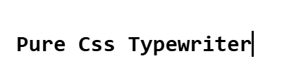
最终效果如下:
思路:
- 借助
border-right和animation实现光标闪送效果,使用width加animation实现字符输入效果 - 使用
steps函数实现让animation实现等距播放 - 使用
monospace、Consolas等 等宽字体保证steps函数的阶跃动画每次变化都是一个完整的字符
提示
等宽字体 等宽字体是指每个字符(字母、数字、符号等)占据相同水平宽度的字体,中文比较特殊占据两个字符宽度
实现代码如下:
<div>
  <h1>Pure Css Typewriter</h1>
</div>


<style>
h1 {
	font: bold 200% Consolas, Monaco, monospace;
	border-right: 0.1em solid;
	width: 19ch; // ch表示一个字符宽度
	margin: 2em 1em;
	white-space: nowrap;
	overflow: hidden;
	animation: typing 3s steps(19, end),
		cursor-blink 0.3s step-end infinite alternate;
}

@keyframes typing {
	from {
		width: 0;
	}
}

@keyframes cursor-blink {
	50% {
		border-color: transparent;
	}
}
</style>
1
2
3
4
5
6
7
8
9
10
11
12
13
14
15
16
17
18
19
20
21
22
23
24
25
26
27
28
29
2
3
4
5
6
7
8
9
10
11
12
13
14
15
16
17
18
19
20
21
22
23
24
25
26
27
28
29
以上为纯css实现打字机效果,但因为中文占两个字符而steps函数仅支持等距步长所以无法支持中英文混和字符串,如果想实现所有字符的打字机效果需要借助js实现。具体实现见我的另一篇博文js实现打字机效果
上次更新: 2025/09/05, 8:09:00